I put this up the other day at my Talyst blog. I don’t often cross post between that blog and this one because I tend to keep the “corporate” blog a bit more watered down. But in this case I thought it was worth it. I’ve been thinking a lot about the use of color in pharmacy labels. I’m not sure why we don’t see more of it in pharmacy. It may have something to do with the limited number of suitable color printers and label stock. As prevalent as color printing is in the consumer world, you’d think it would be simple. Unfortunately it’s not.
I for one think color has a place in the pharmacy. It could be used to improve patient safety, and when used appropriately improve workflow and operations.
The U.S. Food and Drug Administration’s Center for Drug Evaluation and Research (CDER) had the following to say about the use of color in healthcare in 2005(1):
- Color matching – application of color to match one item to another—used in the medical device area.
- Color differentiation – use of color to enhance features on a label, labeling and packaging to distinguish or differentiate one item or product strength from another.
- Color coding – systematic application of color to aid in identifying, differentiatÂing or classifying a drug generally within the same pharmacological class.
- Color branding – use of color to differentiate drugs within the same pharmacoÂlogic class that is managed by a single sponsor.
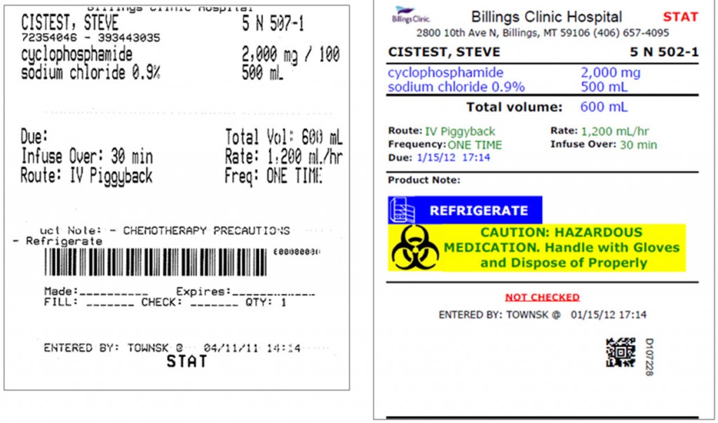
While color coding and color branding may be controversial, the use of color differentiation appears to offer potential in the acute care pharmacy environment. Color differentiation can be used to draw attention to important information or differentiate products at a distance. The image below is an excellent example of how color may be used to enhance an IV medication label, thus giving healthcare providers quick and easy access to important information. The addition of color highlights important information without detracting from the rest of the information on the label. Healthcare providers can quickly find information on the color label on the right that may otherwise be difficult see with the standard black and white label on the left.
Of course, one must remember not to get carried away with the use of color. There appears to be a fine line between appropriate use of color for differentiation and the overuse of color, which may lead to inappropriate reliance by the user, complacency and selection bias. Such a situation could be compared to a student that uses highlighter pens of various colors to color code a textbook only to realize that so much of the book has been highlighted that important information no longer stands out, and is instead lost in a sea of color where its importance is lost.
The use of color to differentiate important information on medication labels in the acute care setting appears to be justified at this time. Moreover, careful and judicious use has the potential to improve patient safety and improve pharmacy distribution. While no one is claiming that color differentiation is the answer to all dispensing errors, it is certainly a tool worth investigating.
(Image credit: Kyle Townsend, Pharmacy Services, Billings Clinic, Billings, MT – used with permission)
References:
Meeting summary: Use of colour on pharmaceutical labeling and packaging Part 15 hearing Bethesda (MD)Food and Drug Administration (US), Center for Drug Evaluation and Research; 2005. March7[cited 2008 Dec 18]. Available from: http:// www.fda.gov/OHRMS/DOCKETS/98fr/05n-0036-nh00001.pdf
2 thoughts on “Color to differentiate information on pharmacy labels”