I was browsing for something the other day and got sidetracked by a link about prescription bottles. You know how it is, you start scouring the internet for information on antibiotic dosing in CRRT and end up looking at cat videos. It happens.
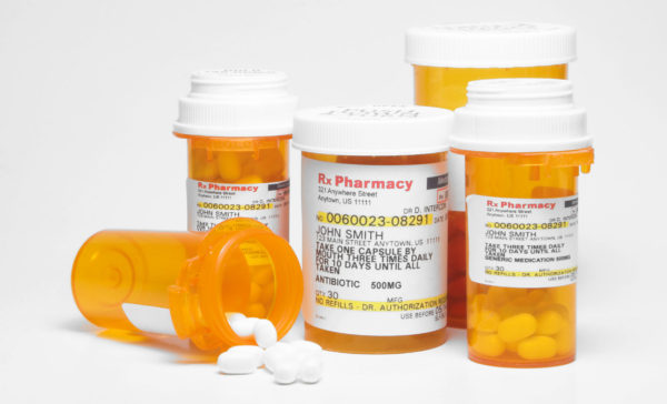
Anyway, I think it’s safe to say that everyone has seen a prescription bottle. Those cylindrical amber bottles with white caps that are almost universally used by pharmacies everywhere. Oh sure, there are minor variations here and there – like blue bottles, for example – but for the most part, they’re pretty standard across the board. In fact, you probably have a few strewn around the house in the “medicine cabinetâ€, in a handbag, or thrown in a drawer somewhere.

Do you ever wonder why they look the way they do? I have, but never really cared enough to look into it. Until now, that is. Cat videos, remember?
Apparently, prescription bottles as we know them today were introduced sometime in the 19th century. They weren’t always cylindrical. Some of the early designs were actually rectangular. The rectangular brown wide-mouth bottle can still be found in the wild, but you don’t see them often. They’re really cool, but are made of glass and cost significantly more than a $0.01 amber plastic vial.
Prescription vials are colored to prevent light from damaging light-sensitive drugs. Are all drugs light sensitive? No, but it doesn’t make sense to have different bottles for different drugs. Does it have to be amber? No, but I read somewhere that amber is the most cost-effective color. I don’t know if that’s true, but it would make sense as to why we don’t see more color options. Why not use a solid material, i.e. one you can’t see through, to prevent light from coming through the bottle? Fair question. My guess is because the semi-transparent nature of today’s prescription bottle allows you to see the contents without having to remove the lid. However, when looking at the contents of a prescription vial, I always remove the lid to evaluate the color and condition of the contents.
That’s the nuts and bolts of the modern prescription vial. There’s a lot more history if you’re interested. For those of you that crave a deeper, more detailed history of the prescription vial, I direct you to History of Drug Containers and Their Labels by George Griffenhagen and Mary Bogard. Real page-turner, that one.
Knowing that modern prescription bottles have been around for more than 100 years, one has wonder why we haven’t seen more innovation. Is it because they’re perfect? Doubtful. More likely the lack of innovation has been due to complacency.
With that said, there have been a couple of advancements in recent years. One high-tech solution, and one not so high-tech solution.
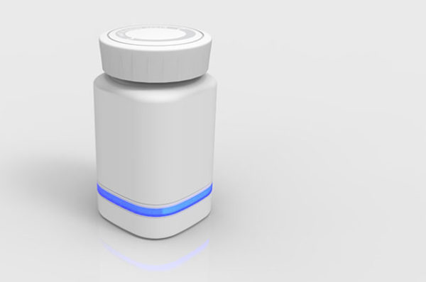
AdhereTech introduced a “modern†prescription bottle several years ago. I wrote about their bottle design back in 2013. Since that time, the company has introduced a new bottle design, which by the way is similar in size and shape to the brown wide-mouth bottles mentioned above. The new bottle can be seen in the image below. It’s unclear to me what made them alter the design. I’ll have to do some digging.

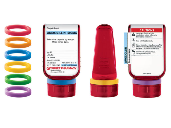
The second, more low-tech innovation comes from Target of all places. The retail giant introduced the ClearRx bottle more than ten years ago. You can read more about the ClearRx bottle/system at the ISMP site here. The bottle has a rather impressive design. It’s simple yet elegant. However, it’s unclear whether or not Target continues to use this bottle since being acquired by CVS. I guess I’ll have to venture out of the house and find out.

The prescription bottle has a long and rich history but it seems to me that it’s time for someone to come up with something new. With the advent of 3D printing, it shouldn’t be too hard to come up with several potential prototypes in a relatively short period of time. Crud, I have a 3D printer. Can’t be that hard, can it?
Leave a Reply