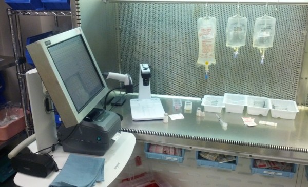
Yesterday, I had a great opportunity to spend the day using DoseEdge in its native environment. That is to say, I staffed at a facility that was using DoseEdge in its cleanroom to prepare CSPs, including patient-specific products as well as stock bags, TPNs, etc. I’ve used DoseEdge for brief periods in the past. I’ve also spent time with the engineers that have worked on the product, product managers, sales people, marketing folks, and various other Baxter employees at conferences like ASHP midyear. But, this is only the second time that I have worked an entire “staff pharmacist” shift using the product. And as one might imagine, using a system in its native environment can often provide a new perspective.

I’ve written about DoseEdge, and systems like it, extensively on this site over the years. A quick search of jerryfahrni.com revealed several articles mentioning DoseEdge, dating back to 2010. I’ve also written about DoseEdge and similar products extensively elsewhere.
With over 300 installs in the U.S., DoseEdge is one of the most popular IV workflow management systems on the market and is still the most widely implemented product of its kind in the U.S. It’s a very good system, certainly in my top five. There are several things that I really like about the system, such as how it controls labels, its ability to track partial vials, and the fact that it talks. Seriously, it speaks to the user. Pretty cool.
However, there’s always room for improvement. For example, after using the system, I found that I don’t really care for the user interface (UI). I found it to be rather unintuitive and a bit clumsy. The UI is stuck somewhere between a legacy system and a modern web-based system. It’s not good. Too many clicks, things in weird places, naming conventions that simply don’t make sense in my mind, just to name a few. With that said, it’s still quite usable, and honestly, it’s likely as good as any other UI on any other product that I’ve used in the pharmacy.
The other thing that hit me yesterday was just how terrible the process of using images is to verify the accuracy of compounded products. I don’t care for it. As good as the images are – and they’re quite good in DoseEdge – there are still shadows in strange places that make reading syringe volumes difficult at times. This is especially true for small volumes. There were times yesterday when I simply made educated guesses to the exact volume and assumed that the volume was accurate, as I couldn’t quite see the exact location of the plunger. Don’t get me wrong, this is still way better than the syringe-pullback method, but image-assisted verification isn’t optimal. I would have liked to have had the gravimetric option available to me yesterday. DoseEgde offers gravimetrics, although it isn’t widely used.
So, good system, but not perfect. Better than the manual process, but room for improvement. Imaging better than pullback, but not great.
Leave a Reply