I spent the day in San Francisco attending the Tableau 8 Roadshow event.
Tableau is an amazing piece of software that helps you link to data in various forms – SQL databases, Excel spreadsheets, Google analytics, and many, many more – and use that information to create stunning visualizations. It’s insanely easy to use, and quite frankly is one of the most impressive pieces of software I’ve ever used to present data in an easy to understand manner.
The roadshow included one hour hands-on sessions for basic and advanced users. Â The beta release of Tableau 8 was made available to everyone before and during the hands-on sessions. I’d never used the software so obviously I attended the session for beginners. In less than an hour I was able to easily create several different “sheets” that included all types of graphical data (bar graphs, scatter plots, predictive graphs, regional graphs, etc) with various filters, date ranges (years, quarters, months), etc. The graphs were easily sorted, arranged and color coded to my particular taste. The sheets were then dropped into a dashboard for the end user. It took me less than 5 minutes to build the dashboard, add filters, and add customized text. The drag and drop nature of the software is impressive. The real beauty of the dashboards is that end users can view them via the web, they’re interactive, and they can be changed and saved in real time based on user preferences. Awesome.
In addition to the awesome functionality, Tableau also has APIs for both the back end database as well as the web component of the software. In other words, if you have some programming skill you can do whatever the heck you want.
According to the website:
 Tableau Desktop is based on breakthrough technology from Stanford University that lets you drag & drop to analyze data. You can connect to data in a few clicks, then visualize and create interactive dashboards with a few more.
We’ve done years of research to build a system that supports people’s natural ability to think visually. Shift fluidly between views, following your natural train of thought. You’re not stuck in wizards or bogged down writing scripts. You just create beautiful, rich data visualizations.
It’s so easy to use that any Excel user can learn it. Get more results for less effort. And it’s 10 –100x faster than existing solutions.
It’s easy to imagine a thousand uses for Tableau in the pharmacy work space. I’d love to see someone take the time to line out some use cases.
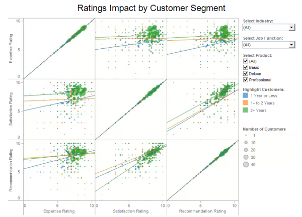
There are some example end user dashboards at the Tableau site here. Hours of entertainment.
Leave a Reply